
Introduction
Corvette is an American sports car produced by Chevrolet. It is a division of General Motors. A popular opinion says that the name “Corvette” was chosen to represent fast, small and super manuverable cars. The theories behind the name of the origins this car is unknown but it has become one of the most iconic performance automobiles in America.
Logo Details
Logo designed by: Robert Bartholomew
Meaning
Over the years, Chevrolet Corvette changed a great deal about its logo. The current logo of this car brand has two flags designed in a way that looks like the letter V. The color combination of the car shows power and mastery.
Colors
Black, Grey, Red, Yellow
History of Chevrolet Corvette Logos
Chevrolet Corvette changed its logo 10 times in the following ways.
1953
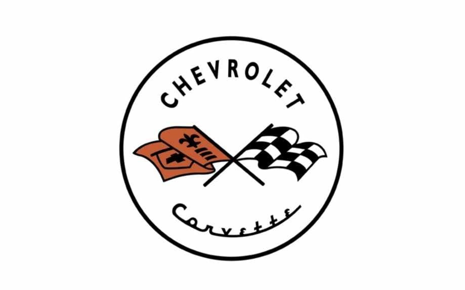
Logo has a black circle with white color fill. The name of the car manufacturer “Chevrolet” is written in black color with all letters capitalized. Below it, there are two 2 racing flags facing opposite sides and are interlocked. Left flag is pinkish brown in color and has a logo of Chevrolet in it and a fleur-de-lis with three horizontal lines. The second flag on the right has white black boxes. Below these flags, Corvette is written in black color with a very distinctive font; the font is almost unrecognizable. The word Chevrolet is designed in Simple Calibri Body font.
1955
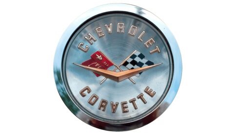
This logo is a silver colored logo. It has two internal loops and the last one has Chevrolet written on the top followed by the same 2 flags designed in the same way. The flags are overlapped by an extended letter V in rusty color. Below these figures, Corvette is written in capitalized letters. This time, the words are designed in Agency FB font.
1963
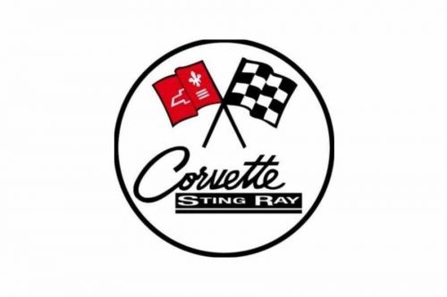
The logo took a U-turn and looked like the first logo. The logo has a black circle with white color fill. It has two racing flags designed in the same way and below it, Corvette is written in black color. Below it, there is a black rectangle and Sting Ray is written in white color. The letters S and R are capitalized and the rest of the letters are small. Below it, there is a black line. The letter Corvette is designed in Luis Serra font. The words Sting Ray designed in stretched Simple Calibri Body Bold font.
1968
The logo has a transparent background with just the racing flags. This time the white color has been replaced by grey color and the left racing flag has a red color.
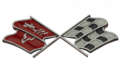
1982
This logo has a grey color with black outline and with white color fill. There is a customized shape of a rectangle extending outside the circle. The rectangle has a grey outline and is divided into two parts. The left part has white and black boxes and the right part has pinkish red color with a Chevrolet logo in light brown color.
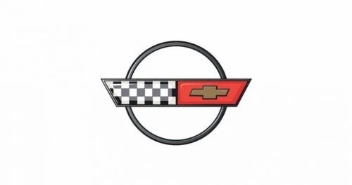
1997
This logo has a customized shape of circle in black color with white color fill. The logo has the same 2 racing flags but this time these flags are extending outside the circle. Plus, the left flag has white and black boxes and the right flag first has the logo of Chevrolet and fleur de lis shape.
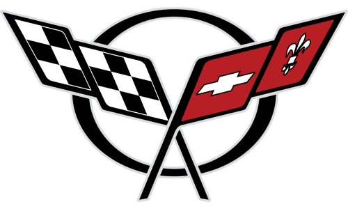
2005
This logo has a transparent background and the two red flags are shaped into the letter V. The flags have the same figures. The whole shape has a black outline and below it, Corvette is written in black color with all letters capitalized. The word Corvette is designed in customized Outrider Academy Italic I font.
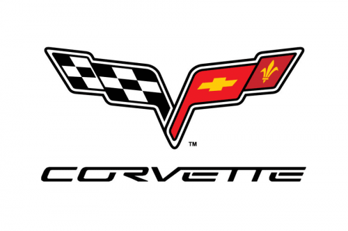
2014
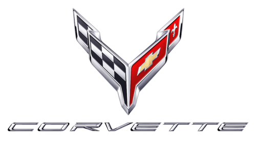
The logo is the same like the logo of 2005, the only difference is that it is given a realistic and metallic touch. The font style is the same. The font is still the same.
2019
The logo is still the same. The edges of the letter V are now closer. The font used to design the logo is Ultra 911 Italic.
2020
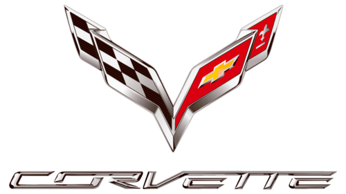
The logo remains the same and the only difference is the color; the silverish metallic color is replaced with dark grey color. The shape and the letters have a black outline. The font style is the same.
Chevrolet Corvette: Company Overview
Chevrolet Corvette is a two-setter car. It is an American line of sports car owned by Chevrolet brand. It is marketed and manufactured by GM. This line of sports car was started in 1953. Chevrolet produced 8 series of Corvette from C1 to C8. This sports car is known for its competitive pricing, composite body work, lightweight fiberglass, distinctive style, and performance. This sports car has two competitors: Chrysler and Ford. But Corvette is the only two-seater sports car which came as the halo car of Chevrolet. The idea of two-seater car went up in the market after the launch of Chevrolet Corvette. This is known as the super class sports car due its rear mid-engined layout, competitive chassis innovation, a V8 engine, and 6-cylinder convertible.
Conclusion
In the last logo of Chevrolet Corvette, the fleur de lis is very neat and clear. This is the logo that can be seen on the cars bonnet without the name of the company. The current logo is very sharp and represents dominance of its power and speed. The company doesn’t tends to change the logo for a couple of years now.
FAQs
Why Chevrolet Corvette logo has a fleur de lis shape?
The fleur de lis means the flower of lily and in French it represents purity and peace.
Who designed the Chevrolet Corvette logo?
The Chevrolet Corvette logo was designed by Robert Bartholomew.
How to download the latest logo Chevrolet Corvette logo?
You can download the latest logo of Chevrolet Corvette logo from VectorSeek for free.