
Introduction
De Tomaso was a car manufacturing company based in Italy that was founded in 1959 and was defunct in 2012. The company was founded by Alejandro De Tomaso and was headquartered in Modena, Italy. De Tomaso cars were famous for having performance of American muscle with Italian design. Some of its famous models include De Tomaso Mangusta.
Logo Details
Logo designed by: Alejandro De Tamosa
Meaning
De Tomaso was named after the founder’s surname. De Tomaso logo is a representation of heritage and the country’s origins.
Colors
Black, White, Blue
History of De Tomaso Logos
De Tomaso changed its logo 4 times in the following ways and years.
1959

This is the first De Tomaso logo. The logo consists of a 3 nested vertically designed rectangle. The first layer is black, followed by grey layer, and the last layer is vertically divided into 3 parts; blue, white, and blue. This layer also has a customized letter ‘T’ designed with two distinctive shapes in black with a white outline. The letter ‘T’ represents the name of the company Tomaso and the blue and white color is associated with Argentina flag.
2009

This is the second De Tomaso logo. This logo must have been designed by a super creative graphic designer as they managed to design two letters in a single shape. The first initials of the company are designed in a single element in black. Below this shape is the name of the company designed in black with all uppercase letters using customized Calibri Body Bold font type. The letters ‘D’ and ‘T’ are larger than the rest.
2019

This is the third De Tomaso logo. This logo resembles the 1959 De Tomaso logo. It consists of a vertically designed rectangle in black with soft and curved edges with the same colored strip design in the center of the shape. The center of the shape has the letter ‘T’ designed in black with two different shapes. This shapes looks like a horn which represents the founder’s family cattle ranch.
2022
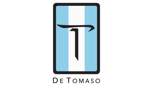
This is the current De Tomaso logo. It is very much alike to the 2019 De Tomaso logo. There are only two differences in this logo; first, the blue and white colors are dull and faded. Second, outside below the vertical rectangle is the name of the company designed using the same designing details as used in the 2009 De Tomaso logo.
De Tomaso: Company Overview
De Tomaso Automobili LTD was a car manufacturing company based in Italy. The company was started in 1959 by Alenjandro De Tomaso and was closed in 2012 due to bankruptcy. The company was headquartered in Modena Italy and it was famous for producing auto racing vehicles and sports prototypes which also includes Formula One racing car for Frank Williams in 1970. The company was mostly funded by Amory Haskell Jr. The company’s 84% shares were bought by Ford Motor Company and resold them back to De Tomaso in 1974 which caused a huge loss and ultimately had to close the company for good. This company was sold to Ideal Team Ventures in 2014 and it made a came back in 2019 with a new product named De Tomaso P72.
Fun Fact
De Tomaso launched a car named Pantera which has American V8 engine and Italian design making it the most iconic car from 1970s to 1980s.
FAQs
What is the slogan of the De Tomaso?
The slogan of De Tomaso is “La Tradizione Paga” which means “Tradition Pays” in English.
Who designed the De Tomaso Mangusta car?
The De Tomaso Mangusta car was designed by Giorgetto Giugiaro.
Who designed the De Tomaso Pantera?
The De Tomaso Pantera was designed by Tom Tjaarda.
Who designed the De Tomaso P72?
The De Tomaso P72 was designed by Jowyn Wong.