The blue color has been replaced with an Aurora Green color. This color almost looks like a blue but it is not in actuality. Fans should know that it is a permanent change in the logo. The old dark royal blue color reminded people of Sleeping Beauty’s or the Cinderella’s castles. Many are saying that since Hulu has become a part of Disney Plus so the green color of Hulu and Disney Plus’s blue colors are merged into a single hue.
Disney+ Old Logo
This is Disney Plus old logo where you can see a dark royal blue background and Disney is designed in white color. The plus sign is also in white color with it is slightly leaned left. There is a different blue colored arch starting from the letter D and ending on the plus sign. The arch starts as faded with a dark blue color and ends on a full visibility with a white color. Basically the arch has descending blue color from left to right.
Disney plus old logo
Disney+ New Logo
Even though this may seem like a shade of blue color but it is considered as Aurora Green color. All the other details in the logo are the same like the way Disney is designed and the plus sign. The arch no longer has a faded color and it is white color. From the left, the point of the arch is somewhat pointy and it is increasing as it reaches the other end which is squared.
People had a nostalgic vibe with the old Disney Plus logo but the good thing is that the icons of the apps are still the same. People say that the new Disney Plus logo is killing the sentiments. There is one thing that we know for sure that people will get used to this new logo.
]]>Tech billionaire, Elon Musk, takes on AI chatbots by announcing the launch of a sassy chatbot that differs from the existing ones in many aspects. Elon Musk challenges tech giants like Google, OpenAI, and Meta by debuting the first ever AI chatbot Grok designed and developed by xAI company. This chatbot is closely integrated with X formerly known as Twitter.
As per Elon Musk, this groundbreaking AI Chatbot is better and provides a significant advantage over the other available chatbot in the AI arena. Grok is interlinked with X, and bot has the real-time access to the social media platform that Elon acquired a year ago for $44 billion dollars. Contrarily, the other available chatbots rely mostly on the older internet data archives. So, this newly launched AI bot has the competitive edge that it is integrated with real-time data from X (Twitter).
As you can see the Twitter X logo and the Grok ai logo are similar.
The Factors that can Elevate Grok in the Market
As per the official statement by xAI, the company behind this AI Chatbot,
“A unique and fundamental advantage of Grok is that it has real-time knowledge of the world via the 𝕏 platform. It will also answer spicy questions that are rejected by most other AI systems”
Elon emphasizes the Grok’s penchant for scarcity and its capability of introducing and bringing a sense of humor into the conversations with AI Bot. In addition to this, this bot will be capable of handling the edgier questions that other platforms restrict. This attribute makes this AI bot a distinctive option in the AI landscape.
Decoding the Naming Choice: ‘Grok’
The word “Grok” is a neologism that was coined by American Science Fiction writer Robert A. Heinlein back in 1961. First time, this term was used in his novel “Stranger in a Strange Land”. However, as per the Oxford English Dictionary, the literal meaning of Grok is “to understand intuitively or by empathy, to establish rapport with”
Initially, xAI revealed the very basic, beta version of Grok that will be improved drastically in the near future. At this stage, Grok manifests the capabilities of the so-called generative AI chatbots currently available in the market. These AI companies that can create human-like text, imagery and codes have attracted investments dramatically this year. Tech aspirants believe this AI revolution could be transformative as the internet itself, protective approach toward this new technology bubble, and commercialization of this technology is still in its initial stages.
xAI is capable of introducing a fully capable bot within just two months of training depicts how the competitors are ready to challenge the market dominance of the ChatGPT by OpenAI that was launched almost a year ago. X users can use the beta version of Grok, this is available for the users of Premium subscribers which costs $16 per month for an unspecified period of testing time. Since the acquisition of Twitter, the revenue and engagement of X (Twitter) have been declining. The introduction of Grok underlines Elon’s efforts to enhance the revenue and engagement of the platform.
Meta Announced 30 Chatbots
Meta will introduce the 30 chatbots in a similar manner across its Instagram, WhatsApp, and Facebook apps. In addition to this, Meta will introduce an AI-powered assistant to address the queries of users.
Elon stated earlier this year that AI will be able to do everything and pose a great threat to human manpower. But he founded the xAI this year. Currently, his engineering team is comprised of ex-employees of Microsoft, and Google DeepMind, and is bracing up to compete with existing and established competitors including OpenAI. However, many experts have shown their reservations about the implications of potential biases.
Risks of misinformation, harmful content, and false perception are floated as a great risk among the established rivals of the AI landscape. According to AI ethics expert Reid Blackman, Elon’s intentions to make the AI Chatbot less corrected politically conveys a great risk. On the other hand, X didn’t respond to these concerns. Despite the fact that Grok rolled out recently, Elon claims the Grok’s abilities to compete the latest models introduced by the Mera and Inflection.
xAI admits that Grok’s ability lags behind OpenAI, OpenAI released the GPT-4 version in March 2023. This is because GPT-4 has performed the human level abilities on professional benchmarks. So, GPT-4 is already part of the applications by the partner companies.
]]>Twitter is a popular social media platform. It allows users to make post short messages. These messages are called “tweets”. People who respond to these tweets are called “retweets”. Users have to follow people to see their tweets and increase engagement by liking the posts.
Users can also connect with different people by connecting with them mentioning them with the help of hashtags and ampersand signs. Twitter has become a platform where news becomes hype. It is also a known for an online place for interacting with public figures, discussions, and information sharing.
History of Twitter Logo
Twitter was created by Evan Williams, Biz Stone, Noah Glass, and Jack Dorsey. It was launched in 2006. It now has more than 25 offices around the world and its headquarters is in San Francisco, California. As of 2022, Twitter has more than 450 million active users. Over the next five years, the Twitter logo went through five different changes.:
- 2006
- 2010
- 2012
- 2015
- 2023
Evolution of Twitter Logo
Twitter was bought by Elon Musk in October 2022. Before this, Twitter was a free social media platform and after the acquisition, Elon decided to make people pay for a verified account. The fee was $8 per month. Many people left Twitter and then began the downfall of the platform. Compared to Facebook and other giant social media platforms which were free, Twitter began to lose its value. Twitter changed its logo in the following ways.
Twitter Logo in 2006
Twitter Logo 2006
Twitter Logo in 2010
Twitter Logo 2010
Twitter Logo in 2012
Twitter Logo 2012
Twitter Logo in 2015
Twitter Logo 2015
Twitter Logo in 2023
Twitter X New Logo Vector
Download: Twitter X Logo PNG Vector
Twitter Business
All social media platforms are separating regular accounts from business accounts. The business accounts are usually paid. Business accounts show you analytics of your business profile allowing users to identify the areas they need to focus on to increase their online presence. Twitter also features business accounts. Twitter business changed its logo 8 times in the following years:
Twitter’s old logos represented an actual Twitter bird. The bird is named as Larry and it was decided by the co-founder Biz Stone.
Twitter X Rebrand
Elon Musk’s biggest rival is Mark Zuckerberg who is the founder and CEO of Facebook. Facebook also bought WhatsApp and Instagram. Even though Elon Musk net worth is more than Mark Zuckerberg but still Twitter has less users than Facebook, WhatsApp, and Instagram. Mark recently launched an app like Instagram naming Threads. After an hour of launch, this app had more than 10 million users. This took a toll on Elon and he has been doing some crazy things lately. Elon rebranded Twitter’s logo to X. People have been asking why is the new Twitter logo an X?
Many people already had the answer to whether or not Twitter is rebranding to X. To answer this question, Elon said, “Twitter was acquired by X Corp both to ensure freedom of speech and as an accelerant for X, the everything app. This is not simply a company renaming itself, but doing the same thing”. The owner said that the company is planning to make it an everything app which means the app will be able to handle audio and video calls, online payments and banking, and also make the app a global marketplace for opportunities, services, goods, and ideas.
Right after the update, there were millions of tweets where the posts said, ‘what is this X on Twitter?’. Ever since Mark launched Threads, Twitter has been making rounds on the internet as well. The Twitter new logo 2023 is the symbol X.
Many think that this is an act of boosting the social media platform in order to get more active users and maybe this is why Twitter was renamed to X. While many people claim that Twitter X logo is stolen, to clear it first, it is a rumor. People think they have seen this logo before. This is because Twitter is owned by X Corp which was established by Elon Musk and it has a similar logo. People has also been asking Twitter new logo X meaning, they should know that after Elon bought Twitter, it became a part of X Corp and this is why it has no deep or hidden meaning. The logo represents being a part of the company.
Conclusion
Twitter rebranding to X has become a hot topic on the internet. So far, we have not seen a lot of changes in the platform but everyone is sensing that something big is coming soon. There are no further details about the Twitter’s new X logo. Users can download Twitter old logos and Twitter new logo for free from VectorSeek.
FAQs
What is the X Symbol on Twitter?
The X on Twitter is the new logo of Twitter.
Why did Twitter replacing the bird?
According to Elon, the X was replaced by the Twitter bird to represent imperfections in all of us which makes us unique.
What is the new name for Twitter?
Currently, there is new name for Twitter and it will be called as it is. As of now, the company has just changed the logo. There is no news whether the name will
]]>YouTube is the world’s most used video sharing platform. It has billions of videos and you can find video of any niche you can think of. The best part about YouTube is that with 2 clicks you can make your own YouTube channel and with a single click, you can upload any video.
People have made a good livelihood by uploading content on YouTube. Now, you can also find YouTube SEO courses to promote your channel in organic way. Though YouTube changed its logo 5 times but YouTube has BHM written on it.
What is YouTube BHM Logo?
YouTube changed its logo on 1st February. BHM stands for ‘Black History Month, B is in orange color, H is in red color and M is in blue color. B, H and M letters have two stars in it in white color. BHM is slightly italicized. All three letters have a white gradient in it. The font used in the YouTube BHM logo is thick bold italicized Calibri Body.
YouTube celebrates black history month and to pay tribute, they put these letters on the right side of YouTube’s logo. This is not a permanent change but users will see this modification for the whole month.
Users should know that this change is seen in some countries only. In Canada and USA, this change in YouTube’s logo is seen in February and in some European countries, this logo can be seen in October.
We want our customers to download the top trendiest logo of YouTube BHM. At VectorSeek, you can download different formats (EPS, SVG, PSD, PNG) of the YouTube BHM logo with a single click. Visitors download the following variants of the YouTube BHM logo:
Who Designed YouTube BHM Logo?
The YouTube BHM logo was created by Leandro Assis. Leandro is an artist from Rio, Brazil who is known for his artwork related to LGBTQ+ rights and black culture. YouTube has also shared its Black History Month video related to the logo.
The video has a black background with icons related to Afro culture mostly relating to dance and music. Though YouTube makes changes in its logo every month to pay a tribute to the world’s iconic personalities YouTube BHM logo became the topic of the year but then again not all countries can see the YouTube logo changes.
]]>The main change is the new icon or Logo representing the package that symbolizes the e-commerce platform’s physical connection between the small and medium business vendor and the customer.
Download Daraz New Logo Vector
So, in this regard, Daraz contacted UK based agency to design a logo in a creative way for Daraz. But this agency scammed Daraz. The agency delivered the Logo to Daraz using a free stock vector by changing its color rather than any creativity.
This move from the agency is unprofessional because it breaks the professional rules of conduct. If you cannot do your assigned work, you should not just leave and talk to your client about it, but in the case of Daraz, the UK-based company has not provided them what they have to deliver as per professional ethics.
![]()
Tygo Pakistan shared the post by saying. Daraz New Logo Copy
So, to avoid such kinds of scams, please get in touch with Vectorseek.
Vectorseek.com is a platform to help peoples who want to get logos with creativity. Because Logo is the primary tool and the first impression of any business or brand. A good logo is an essential part of the marketing for any business. It must be memorable. So, VectorSeek is the solution to this problem.
]]>Here it why…
From Multinational to Startups, whatever the company scale is, the logo is equally essential for any business. A versatile yet straightforward Logo is the most vital marketing tool, and people recall a business by logos on products and advertisements. A survey was conducted on logo recognition of fair trade brands in Belgium by Quality Mark. Results show that roughly more than 90 per cent of the participants were quite familiar with the Logo of Oxfam.
Another Study by the Statista Research Department suggests that Branding plays a pivotal role in buying more than 60% of respondents.
In addition to this, Former American Basketball icon and Businessman, Michael Jordan advocate this concept as,
It’s a habit of mine now, noticing labels, logos, shoes
So, there is no second opinion on logos carrying the business’s inner message and helping companies grow.
However, it is not as simple as it appears. A quality and versatile logo design require many factors to be taken into account. As we have discussed earlier, the logo is a marketing tool for any company. So, the logo should be scalable to any size, from a stamp to more gigantic billboards. The logo should not compromise the quality i-e shape, size and other vital elements for printing purpose on any scale. Arguably, this is one of the basic features of a Versatile Logo.
Versatility Allows Flexibility
The logo’s versatility is one of the most desired features for any logo design in a nutshell. Logo’s versatility allows you to advertise your brand on relatively smaller objects like stickers, rubber stamps, hats, shirts, business cards etc. In addition to this, an artist who is well adverse with Graphic Design abilities keeps your logo compatible with pixel-based media like web banners, social media platform and websites etc. So, Logo Design that is Versatile as well as Modern, provides you with Simplicity and Clarity. Consequently, you should be able to reproduce the logo in different sizes for Brand Marketing.
In the 21st century, we have tons of Social Media Platform, which provides substantial potential customers. So, Versatile Logo is compatible with all social media platforms like Facebook, Twitter and Instagram etc. Last but not least, why you should have a versatile and unique logo for your business is Brand Identity. So, your logo should appear on letterheads, mobile app icons and business cards with the same aesthetics and feel.
Said that one should be convinced of how important it is to ensure the logo’s versatility.
Now, we would be diving into the topic and will see what factors make a logo versatile.
Versatile Logo Should Include What Design Elements?
It is an entirely subjective and challenging matter for anyone to enlist the top Design Elements Should a Versatile Logo Include. But our professional and experienced Graphic Designers have concluded some top of the list factors to enable you to understand what prominent factors of any Logo are to make it Versatile and Simple.
Here are the Design Elements to keep in your mind while designing a logo for your business.
Simple Design for Logo
Less is More. So, do your best to keep your logo as simple as possible. A complex Logo Design compels you to include more colour and elements to your logo. Consequently, your logo becomes bulky and less recognizable. If you look over the Global Brand Logos, you can easily witness that they all are quite simple logos.
For example, Nike Logo is a mono-colour simple swoosh. Similarly, the Apple Pay logo is also a bitten apple with simply written ‘Pay’. KFC logo has a lettering/monogram logo which is a relatively simple and strong logo.
Moreover, if you see the logos of other Global and Giant Companies logo like Samsung logo, Zoom logo, and Twitter logo, you will see one thing similar: SIMPLICITY.
Are you looking for a Simple yet Strong Logo for your startup or small business?
You can think of Hiring a Freelancer who is Well-versed with Graphic Designing and Logo Making. You will enjoy the Customer Services that go beyond the box.
Hire A Logo Designer
![]()
Pay Attention to Details

You have to incorporate the details in your logo design, but too many details make your logo bulky and unfit for scaling. So, you have to approach optimally when it comes to the elements. Try to keep the details less enough to convey your business message. So, always give it a second thought, how much detail is necessary for your business logo.
Sometimes, the detail of lines, colours, as well as fonts becomes inevitable. But too many details and elements cause printing troubles. For example, if you have to incorporate thin and delicate pieces with several colours, these details may vanish when you are printing. On the other hand, if you are printing on small products, these details may appear broken shapes. So, try to remain stringent with more information and keep details minimum as much as possible. Only include the elements that are extremely necessary to convey your message. In addition to this, keeping your logo versatile and straightforward saves your remarkable printing cost.
Space Inclusion or Exclusion
You have to be very careful when your logo design has a negative space or white space. If you overlook it, you may leave the white space inconsistent. Consequently, elements will overlap each other while printing. So, you have to ensure the consistency of white space, and it should not be so close to elements. Contrarily, if you include an ample space between the details, you will not show the association between the elements. Consequently, you would not be able to convey the business message through your logo design.
Be Selective With Color
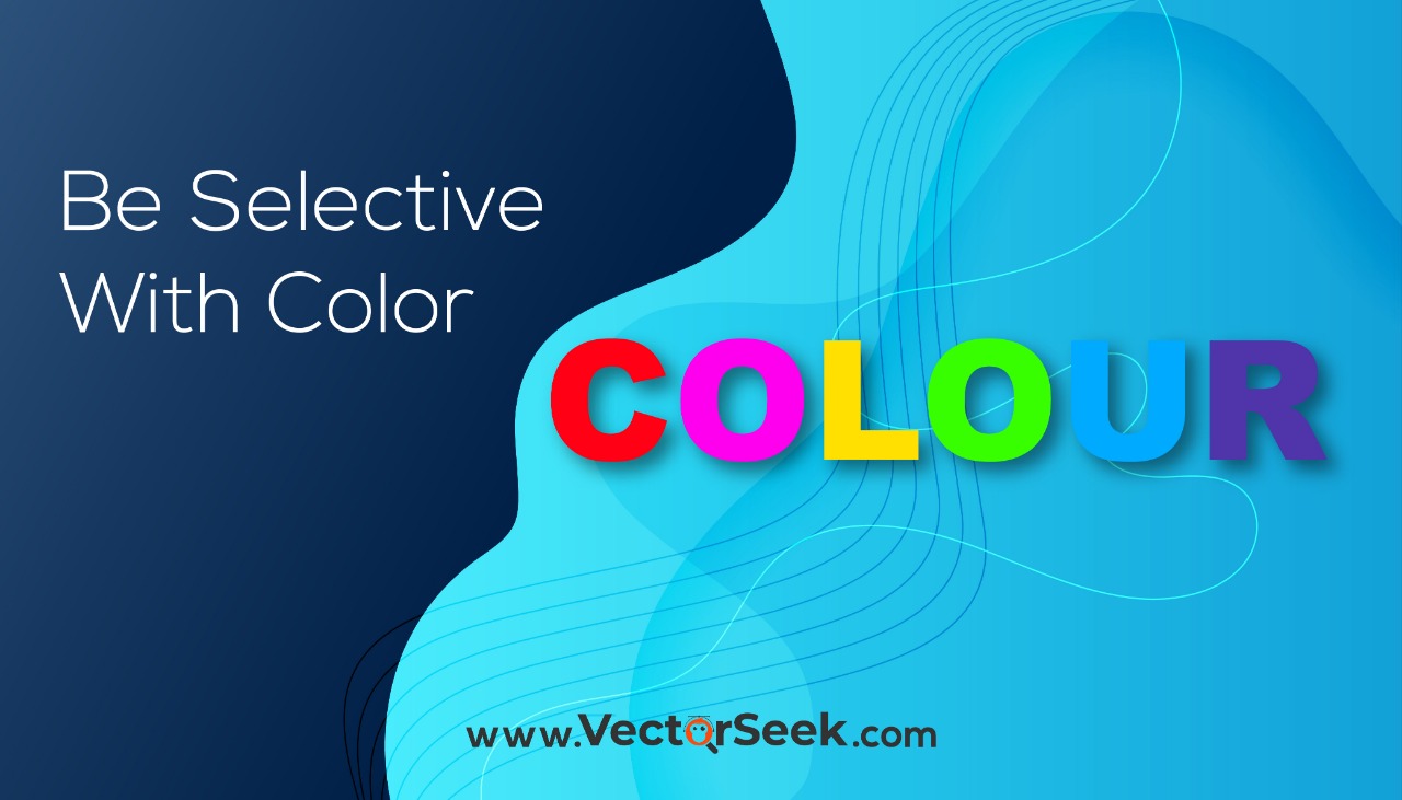
Arguably, the logo is meant to play with human psychology, and the most effective way of doing so is to use effective colours. Colours are helpful to convey your business message and provide a feel. For example, the green colour is best to convey growth, fresh and natural. Similarly, the orange colour conveys warmth and touch. The red colour conveys the alert or energy.
So, having too many colours in your logo triggers too many messages. Consequently, viewers get a mixed feeling or message. You are keeping the colours as low as possible results in a meaningful and clear logo. So, the best practice is not to use more than three colours in your logo.
Colourless Logo
![]()
Though colour consideration is a crucial part of your brand identity, having a quality colourless logo is equally important. Here we are going to explain.
Colourless Versatile Logo Makes You Business Win
Another important factor among What Design Elements Should a Versatile Logo Include is that logo looks great both in colours and without colours. You will need to print your logo in black and white in the newspaper, fax copy, magazines etc. So, your logo should retain its uniqueness and feel when you print it in black and white. This will ensure better logo presentation and brand identity. So, an ideal and expert graphic designer develops the logo in black and white and submits it for approval. If the black and white version of the logo gets approved, the designer starts to fill the colours.
Use Gradients Optimally

Doubtlessly, Graphic Designing is quite challenging, and you have to make the decisions optimally. Similarly, you have to be wise with gradients to make your logo versatile and impactful. So, go for gradients only when they add overall quality and appeal to the graphic designer. Usually, tints and gradients disappear when you print the logo. On the other hand, excessively dark tints will cause spots and patches when you print the logo. In addition to this, many recreation processes cannot handle gradients efficiently.
Conclusion
The versatility of the logo is not as easy a job as it looks. However, if you succeed in making your Logo Design Versatile, it would be a big win for your business. Your logo should be compatible with all of the possible conditions.
We are going to summarize What Design Elements Should a Versatile Logo Include.
-
Simple
-
Fewer Details
-
Use Space Wisely
-
Use Colors Wisely
-
Colourless Logo
-
Use Gradient Wisely