
Introduction
The name Cadillac is derived from a French explorer Antoine Laumet de la Mothe, sieur de Cadillac. He was the one who founded Detroit in 1710. The company was founded by Henry Leland in 1902 and was named Cadillac to honor the explorer. Cadillac is a luxury car brand that represented elegance, high-end, and prestige.
Logo Details
Logo designed by: Mother Design
Meaning
This may be the only car brand logo that has changed 30 times since the founding year of the company. The company glued with black and white colors from 1902 to 1933 which is fair since in that era, there were very specific colors and people focused more in the designs.
Colors
Black, White
History of Cadillac Logos
Cadillac changed its logo 30 times in the following ways.
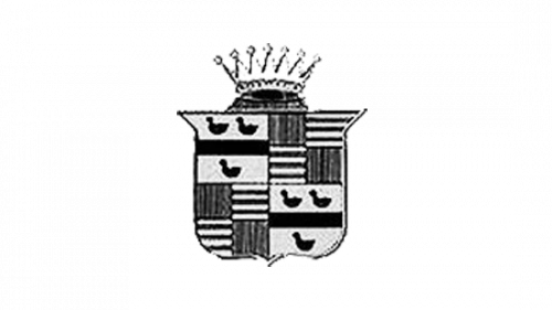
1902
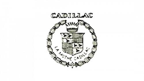
This is the first logo of Cadillac. The logo is customized circle and Cadillac is written in white color with a black background designed in Times New Roman font. The circle is 96% complete. There is a crown inside and top of the circle. Below it, there is the Cadillac shield divided in 4 parts. The first upper left part has 3 black ducks on a white background. Its right part has black and white vertical and horizontal lines. Its left bottom part also has the black and white vertical and horizontal lines and its right bottom part has three black ducks on white background. There is text in the circle “La Mothe Cadillac” designed in Calibri Body font and all letters are capitalized.
1905
This logo is a 3 layered circle. The first layer is designed with black checkers and ducks. The second layer is white in color and has floral ornaments designed in black color. On top of the second layer, there is a head of a crown in black and white color. In the last layer is divided into 4 parts in the same way as it is in the first logo.
1906
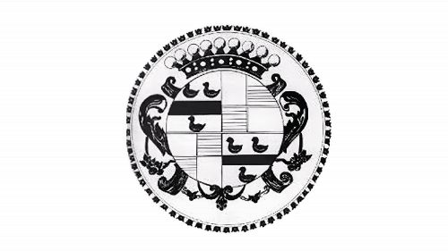
This logo is almost same as the first logo of Cadillac. The circle is a round floral design and there is a black and white crown in the top center of the circle making it incomplete. Below it, there is the Cadillac shield in white color with a black color fill. The ducks are white in color and there are 8 dots near a single duck. Below the shield, the text is back again “La Mothe Cadillac” designed in the same way.
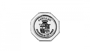
1908
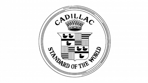
This logo has a black circle with white filling and there are black circular lines in the circle. Cadillac is written in black color in Times New Roman font in black color and below it, there is a black and white crown. Below it, the shield is in light black color with white color fill and the ducks and the vertical and horizontal lines are in black and white color. Below it, there is a text “Standard of the World” in black color with all capitalized letters designed in Times New Roman.
1914
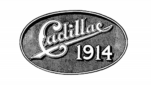
The circle has become a 3 layered oval. The first layer is black in color, the second is in white, and the first has a grey color fill. Cadillac is designed in white color with a grey and white outline. The edge of the last C letter is extended to the first C letter making a separation between the numeric “1914”. These numbers are white in color with a black outline. The font is completely customized.
1915
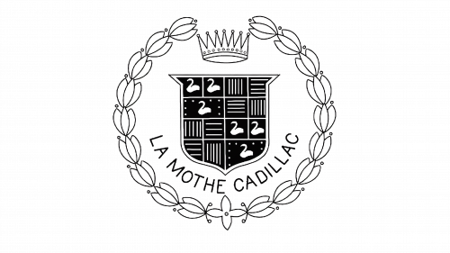
The logo is again a circle with leaves ornaments outside the circle. There is a round floral design inside the circle with a crown in its center. The black and shield is below the crown same figures inside it. The dots around the ducks are gone.
1920
This logo is the same as 1908 Cadillac logo except there is no text. The only difference is that the crown is connected with the shield.
1925
This logo is a customized 5 layered circle. The first layer is black in color and has, followed by grey, then black, and then again grey. The 4th layer is thick and in black and the 5th layer has grey color and Cadillac is written in black color. Below it, there is a black and grey crown and the shield is grey in color having the same figures in black color. Below it “Standard of the World” is written in black color. All the words are designed in Times New Roman font.
1926

This logo is just the shield of the Cadillac. The upper edges of the shield are widened. It has grey color fill with a crown and its inner shield with grey color fill and has the same figure inside it.
1930
This logo of Cadillac has the crown outside on top of the shield in black and white color. The shield is in grey color with black figures designed in it.
1932
The Cadillac logo of 1932 is a 3 layered circle in black and white. The last layer has a black color fill with a white crown inside it. There are words in beneath the crown which are not clear. The second lines of letters have wings on each side in black and white colors which are extending outside the circle.
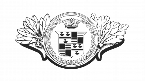
1933
In this year, the circle has gone leaving just the shield and the wings in black and white color. The wings are designed on each side of the shield. The head of the crown in placed outside on top of shield. In the shield, the 3 ducks are separated into two parts; two ducks are on top of one duck separating by a thick black line. The parts with the lines are just left with vertical ones and horizontal lines are now replaced with a black square.
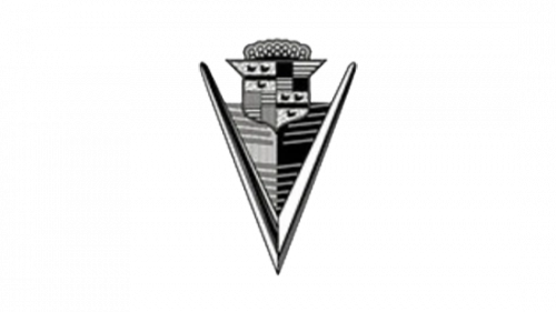
1939
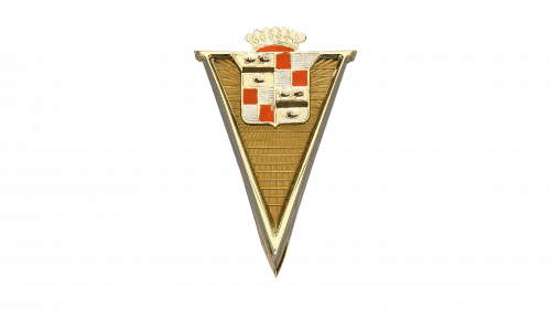
This logo is an upside down triangle in light golden color. The top of the crown head is placed outside on top of the triangle in golden and red color. The shield of Cadillac is just below the crown in golden color. The ducks are in brown color on a golden background and the vertical lines are in white color and the squares are in red color. The rest of the triangle has vertical and horizontal lines that seem to be raying towards the shield. These lines are in dark golden and brownish color.
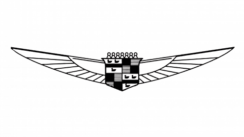
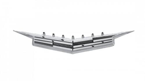
1942
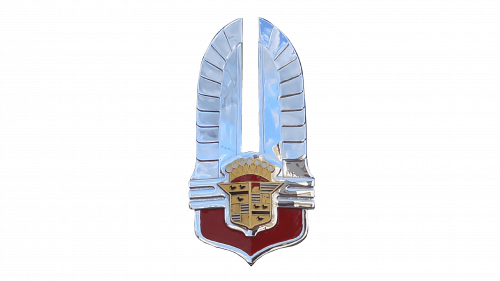
This logo has a feathered crown in silver greyish color and has the shield in bottom center of it in matte golden color. The head of the crown is in golden and red color. Below it is the shield in golden color. The ducks are in black color the vertical lines are in black and white color and the squares are golden in color. There is a pointed bottom in red color with a silver outline.
1947
The 1947 Cadillac logo is in black and white color. It has a large letter V in black and white color and there is a head of the crown and the shield in black and white color. Below the shield, the letter V is separated with 2 colors; grey and black. Both parts have grey vertical lines. In the shield, the top right part of the shield has black and grey vertical lines with black squares and the bottom left part of the shield has grey and white vertical lines with grey squares. The ducks are in black color.
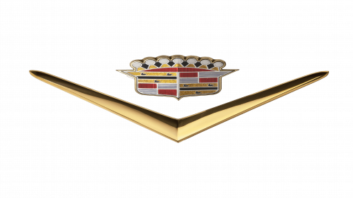
1949
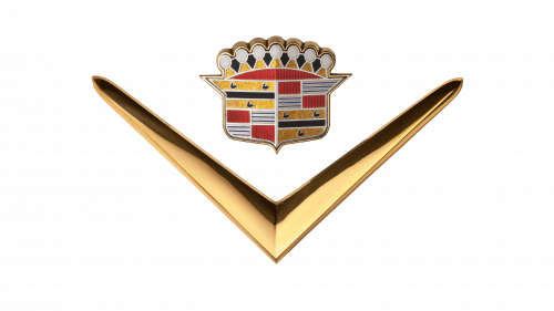
This logo again has a golden and brown V letter. The edges of the letter V are widened to make space for the head crown and the shield. The head crown is in golden, black, red, and grey color. The shield is in golden color. The ducks are in black color with a shimmery golden background. The vertical lines are in blue and grey color and the squares are in red color.
1952
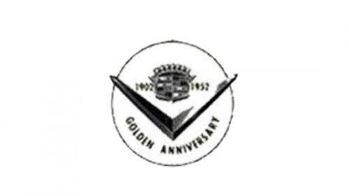
In this year, the company made a black and white logo in the remembrance and the celebration of completing its 50 years. This logo has a black circle with a white color fill. There is a black V designed in the circle and its edges are slightly extending outside the circle. Above the V, there is the head crown and the shield in black and white color. Outside on the left side of the shield, 1902 is written in black color and on its opposite side, 1952 is designed in black color. Below the V, Golden Anniversary is written in black color with all capitalized letters and designed in Calibri Body font.
1953
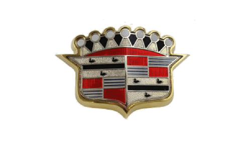
This year, the logo is just the head crown and the shield. The head crown has black, red, and silver color. The ducks in the shield are in black color on a white background, the vertical lines are in grey and blue color, and the squares are in red color. The borders of the shield are head crown are in golden color.
1956
The logo is the same as the logo of 1949 Cadillac logo. The only difference is that it stretched out a lot.
1960
The logo is given a stretched V shape. The head of the crown is more minimized in the logo. The logo is in grey and black color. The ducks are in black color on a grey background. The parts with the vertical lines are now replaced with grey squares and have black squares as well.
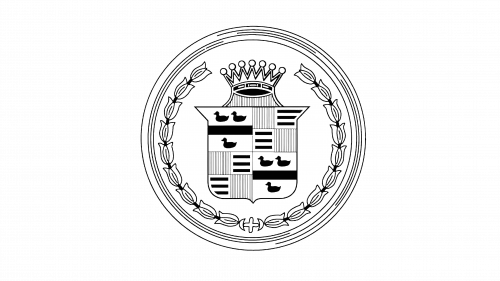
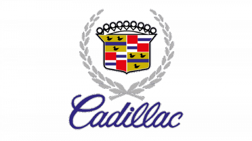
1963
This logo has a wreath in silver color and has the crown and the shield designed attached with the wreath with a vertical cylinder in the same color. The head crown is in silver color and inside the shield, the ducks are made in white color on a yellow background. The separation line of the ducks is in black color. The vertical lines are back in this logo and are in blue and white color with red squares.
1964
The logo just has a grey and white head crown and the shield also has the same color combination. The ducks are in white in color on a grey background and there are now two separating lines in white color. The vertical lines are grey and white color with grey square.
1965
The logo is the same as the logo of 1956 Cadillac logo. The V is in silver color. The head crown is in grey and white color and the ducks inside the shield are in white color on a yellow background, the separation lines are in white and blue colors, the vertical lines are also in white and blue colors, and the squares are red.
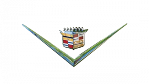
1971

The logo is similar to the logo of 1942 Cadillac logo. Instead of the feathers, the logo now has what looks like a customized triangle in silver color and has hollow white spaces. It is attached to the head crown and the shield which are in grey color. The ducks are in black color with a grey background with black separating lines, the vertical lines in grey and white colors, and the squares are in white color.
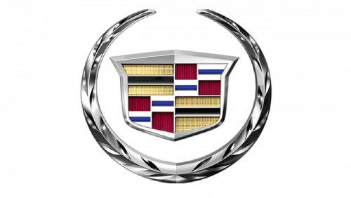
1980

This logo is same like the logo 1963 Cadillac logo. The only difference is the silver cylinder linking the wreath and the shield is now gone. The colors of the figures in the shield are also the same.
1985
![]()
This logo is the same as the above one. The difference is in the colors. The wreath is in golden color with black outline. The head crown is golden and the shield is in golden color. The ducks are white on a yellow background with black and white separating lines, the vertical lines are black and white, and the squares are in pink color.
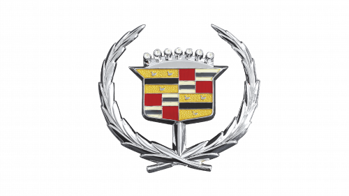
1995
The logo is almost the same again. The wreath is in grey color and the head crown is in black color. The colors of the figures in the shield are similar to the 1965 Cadillac logo. Outside below the wreath, Cadillac is written in blue color and is designed in Blackadder ITC font. The letter C is capitalized and the rest of the letters are in small case.
2000

The logo is given a realistic metallic look. The wreath is in silver metal color. The ducks in this logo are gone. The top left and the bottom right part has two yellow and a single black line. The vertical lines in the shield are in blue and grey color and the squares are red. The border of the shield is in greyish silver color.
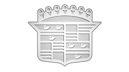
2009
This logo is given a 3D look and the rest of the logo is the same as the 2000 Cadillac logo.
2014
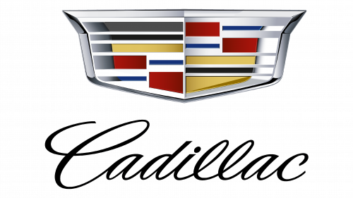
The wreath is gone from this logo and below the shield, Cadillac is written in black color and is designed using the same font type as used in the 1995 Cadillac logo.
2021
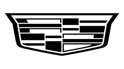
The logo is the same as the logo of 2014 Cadillac logo and it is in black and white. The name of the company has gone from the logo. This logo represents excellence in minimalization.
Cadillac: Company Overview
Cadillac is also called Cadillac Motor Car Division. It is a General Motor company in America that designs, manufactures, and sells luxury automobiles. The company is famous in the US, China, and Canada. The company was founded in 1902 and became a division in 1909. It was founded by Henry M. Leland, Lemuel Bowen, and William Murphy. It was acquired by General Motors in 1909 and now its headquarters is in Detroit, Michigan, US. Its current President is Steve Carlisle. Cadillac vehicles are sold in 34 countries around the world. In the 2000s, the company outsold its vehicles compared to Mercedes and BMW. In 2019, the company made a record of selling 390,458 vehicles around the world.
Conclusion
The journey modifications of the Cadillac logos have been a lot. We haven’t come across any car brand that has this many logos. All the logos took massive transformation. The shield has been never been replaced in any logo. This shows dedication and sticking to their grounding values. Seeing so many logos over the years, we are sure there must be a logo coming up by the company in the next few years.
FAQs
Who designed the latest logo of Cadillac
The latest logo of Cadillac is designed by a graphic design company based in New York City named as Mother Design.
Who designed the first logo of Cadillac?
The first logo of Cadillac was designed by Harley Earl.
What is the slogan of Cadillac?
The slogan of Cadillac is “Standard of the World”.
How to download a copyright free logo of Cadillac?
You can download copyright free logo of Cadillac from VectorSeek.